
Should your fitout reflect your company colours?
When you’re planning a new office fitout, you need to think about colours.
The right colour scheme can work wonders.
The wrong colour scheme can cause a headache — literally.
And how much influence should your brand colours have over your colour choices?
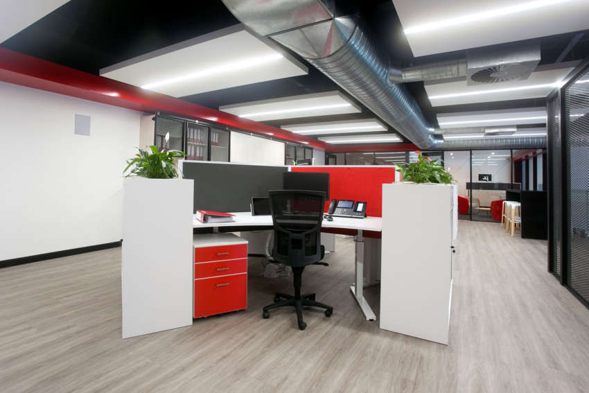
We find that many of our customers (when they’re not using a designer) use their brand colours as the starting point for their colour scheme. They come to us looking for red chairs and screens to match their logo colour, or black desktops to tie into their corporate colours.
And often this spells a recipe for disaster.
You see, you should never use your corporate colours to dictate your office fitout colours too literally. Your company colours might work on paper, on screen and at small scale, but they won’t always work in the context of an office fitout. A small purple logo is different than a large purple wall, for example.
Your corporate colours can help guide your choices, but be careful of overdoing it.
Here’s why.
Your colour choices need to work with the environment and lighting
If your corporate colour is dark blue, for example, it wouldn’t be advisable to paint the walls of a small dark space in your corporate colour. That would close the space in and make it feel cold and unwelcoming (unless of course, that’s the effect you want). So you need to think carefully about what colours to use and where.
Some things to consider are:
# The amount and colour of light, both natural and artificial
# The size of the space
# The purpose of space
# Adjacent spaces
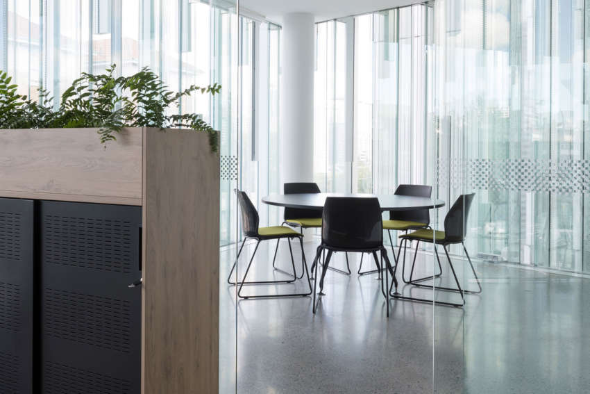
Elements of your company colours can be reflected in your work environment, providing they work within the space. In some spaces a big block of bold colour can work, in others, you might be better to use subtle accents of colour in the furnishings. Unfortunately, there’s no one rule fits all, but the guide should be consider the space as a whole, and work out which colours are going to work where.
Your colour choices should reflect your brand values not just your brand colours
Colours influence how we see and respond to our environment. As a business owner or manager, it’s important to understand how colour choices—from your logo to your walls—can impact both your employees’ and your customers’ perceptions.
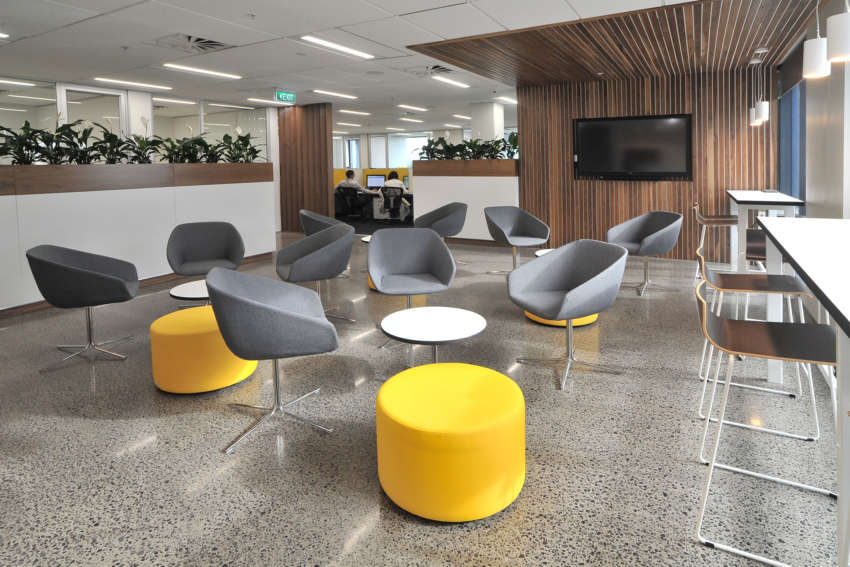
Don’t use your brand colours too literally in your fitout. Think about which colours best match, reflect or even enhance your company values. If your logo colour is red, but you want your staff to feel calm and relaxed, then splashes of red in upholstery fabrics or in artwork will probably be better than a large red wall.
Colours can affect people emotionally and physically, so it’s important to choose them wisely. Which brings us to the next point…
Choose wisely, there is a science behind colours
Colours can affect a person’s mood, state of mind, and overall disposition. Colour theory dates back to the ancient Egyptians who studied the effects of colour on mood. And the development of modern psychology opened the study of colour, which has been used in marketing, graphic, architectural and interior design successfully for decades.
Wondering what the different colours mean?
Here’s a brief overview according to Color Wheel Pro a software tool that helps you create harmonious colour schemes based on colour theory.
Red:
Red is the colour of fire and blood, so is associated with energy, war, danger, strength, power, determination as well as passion, desire, and love. Red is a very emotionally intense colour. It enhances human metabolism, increases respiration rate, and raises blood pressure.
Orange:
Orange combines the energy of red and the happiness of yellow. It is associated with joy, and sunshine, and represents enthusiasm, fascination, happiness, creativity, determination, attraction, success, encouragement, and stimulation. To the human eye, orange is a very hot colour, so it gives the sensation of heat.
Yellow:
Yellow is the colour of sunshine. It’s associated with joy, happiness, intellect, and energy. Yellow produces a warming effect, arouses cheerfulness, stimulates mental activity, and generates muscle energy. When overused, yellow may have a disturbing effect; it is known that babies cry more in yellow rooms.
Green:
Green is the colour of nature. It symbolizes growth, harmony, freshness, and fertility. Green has strong emotional correspondence with safety. Green has great healing power. It is the most restful colour for the human eye; it can improve vision. Green suggests stability and endurance.
Blue:
Blue is the colour of the sky and sea. It is often associated with depth and stability. It symbolizes trust, loyalty, wisdom, confidence, intelligence, faith, truth, and heaven. Blue is considered beneficial to the mind and body. It slows human metabolism and produces a calming effect. Blue is strongly associated with tranquility and calmness.
Purple:
Purple combines the stability of blue and the energy of red. Purple is associated with royalty. It symbolizes power, nobility, luxury, and ambition. It conveys wealth and extravagance. Purple is associated with wisdom, dignity, independence, creativity, mystery, and magic.
White:
White is associated with light, goodness, innocence, purity, and virginity. It is considered to be the colour of perfection. White means safety, purity, and cleanliness. As opposed to black, white usually has a positive connotation.
Black:
Black is associated with power, elegance, formality, death, evil, and mystery. Black is a mysterious colour associated with fear and the unknown (black holes). It usually has a negative connotation (blacklist’). Black denotes strength and authority; it is considered to be a very formal, elegant, and prestigious colour (black tie).
Use restraint
In nature, we’re surrounded by many different colours which provides a balance between calm and stimulation. So when choosing your colours it’s important to think about that balance.
The way colour is placed can be the difference between a space that over stimulates and one that’s just plain boring.
Opportunities for colour
It’s not just the walls that provide opportunities for colour. Here’s a list of areas where you can introduce colour accents into your fitout.
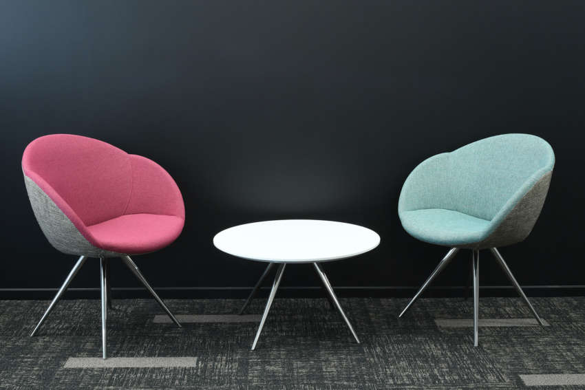
# Upholstery – carefully select the colour and pattern of fabrics for soft seating, screens and dividers, task seating
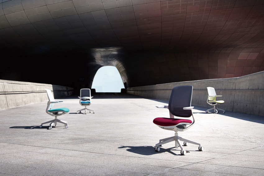
# Furniture – use colour in the furniture elements you select, from task seating to storage, to table tops, and or legs
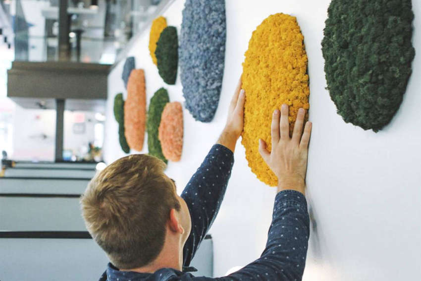
# Nature – use plants and natural finishes to accentuate colours (natural finishes never really go out of style)
# Art – pick art that incorporates colours to compliment your scheme (artwork can also help improve productivity)
Let the experts help
Choosing the right colour scheme for your office is one of the simplest ways you can enhance your performance. But unfortunately, it’s not that simple.
If you’re not sure how to pick the right colours for your office an interior designer will be able to advise you. Or talk to us.
Our mission at Crestline Furniture Systems is to help create vibrant and effective workspaces where people love to work. Want to find out more? Give us a call on 0508 993 993 or email info@crestline.co.nz
